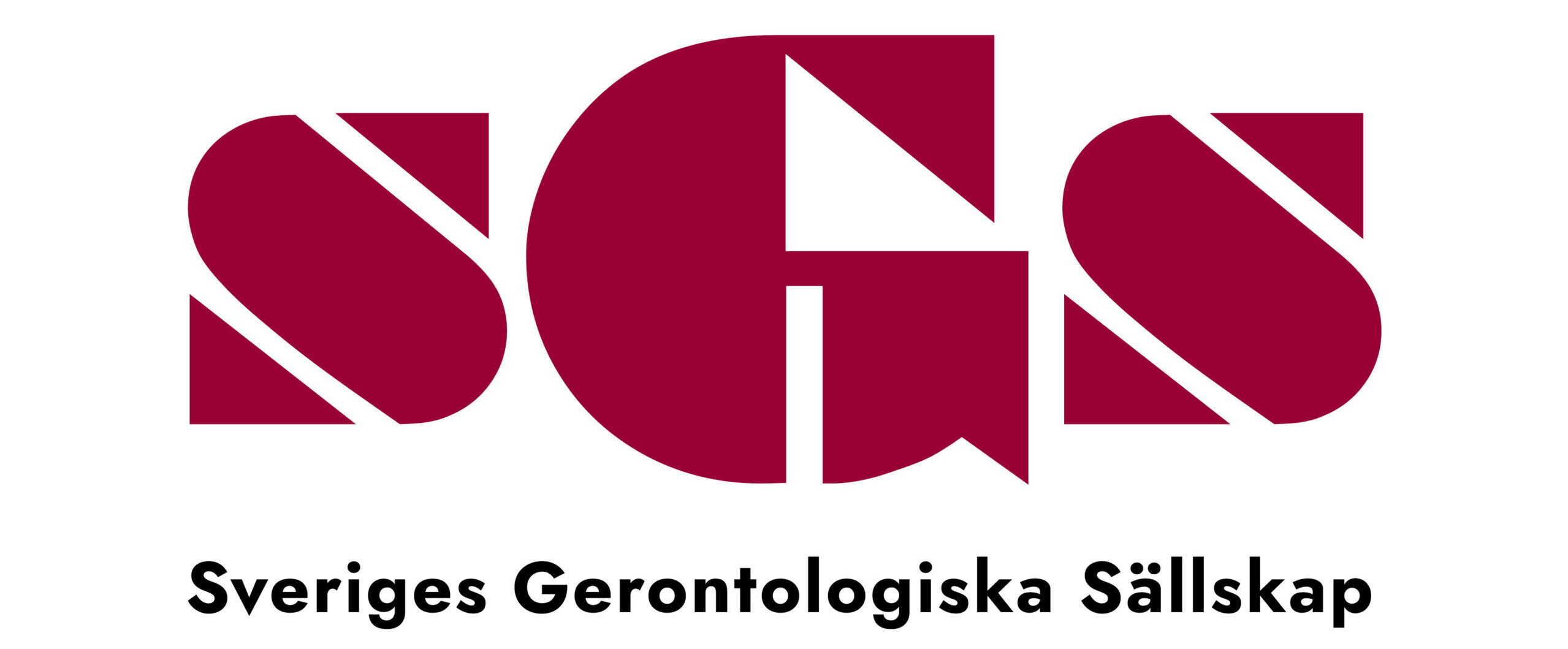
På Gerontologidagen 2023 firades att SGS fyllde 25 år som förening. Detta firade vi genom att lansera SGS nya logotyp. Under 2022 påbörjade SGS styrelse ett projekt för att förnya logotypen – en process som innebar fokusgruppsdiskussioner i styrelsen om hur vi skulle vilja att logotypen ska se ut. Styrelsen landade i att vi ville behålla kontinuiteten och igenkänning av det som var unik och tidlös, men också ta den visuella identiteten till nutid och för det samhället vi verkar i.
Designern för den nya logotypen är Elias Guerrero Jr., Art Director och grafisk designer från Filippinerna, som bland annat har redesignat loggan för Filippinernas äldsta tidning Manila Bulletin och gjort visuell identitet för flera företag. Här citerar vi Elias berättelse bakom loggans designaspekter:
SGS logo re-design
Text av Elias Guerrero,
Art director och grafisk designer
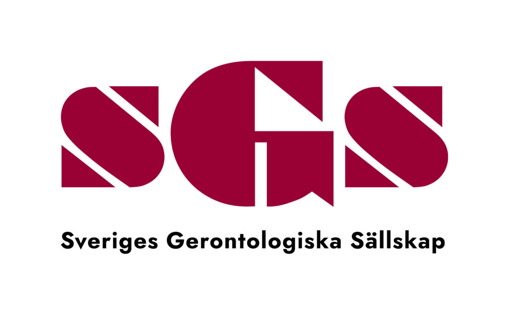
The logo of the Swedish Gerontological Society features the letters S, G, and S in carmine red. It is set in Bragadoccio, a font that was designed by the typographer W.A. Woolley for the Monotype Corporation in the 1930s.
Bragadoccio is a product of the Art Deco era, and as such, this font aimed to embody certain novel ideas of its time. Art Deco was a movement interested in a visual aesthetic that embraced modernity, simplicity, geometrical forms, technological advancement, mass production, and futurism. This can be gleaned in Bragadoccio’s stencilled lines, perfect 90-degree angles, and machine-like circular curves. One might even say that Bragadoccio suggests a 1930s vision of a technologically driven future. When SGS commissioned a graphic artist in the 1990s to design their logo, this was perhaps the underlying thought: to use a font that represented a bold vision of tomorrow, as imagined by someone from the distant past.
In the making of the logo, however, the original artist decided to include a light shadow under the letterforms. This is not an Art Deco motif, but a product of that artist’s own time; advances in computer graphics software made it possible to create realistic looking shadow effects without the use of photography. It is in this spirit that we reimagine the SGS logo once more, adding elements that are of our own time, while still conveying a vision of the future, but this time from our point of view.
The new logo now carries a wordmark under the SGS logo, which reads either “Swedish Gerontological Society” or “Sveriges Gerontologiska Sällskap”. This wordmark is set in Jost, a Google font designed by the typographer Owen Earl in 2020.

SGS gamla logga (1990-talet)
 |  |  |